Project Type
Coursework (individual)
Team members
Hannah Wu
Role
Ux Designer
Duration
Jan 2021 - Mar 2021
Overview
P2P selling is a model that two individuals buy and sell products directly. Sellers love the flexibility of direct selling, but they don't always have much experience in managing a business. In this course project, I was asked to build a desktop experience that helps P2P sellers manage their online stores. This is an individual project, and my responsibilities include iterating persona, investigating user needs, defining design requirements, and creating 3 scenarios of the final hi-fi prototype.
The problem statement for this project is:
"How might we design a desktop experience to help P2P sellers sale and manage bulk items with less effort?"
Solutions:
A web application that ...
01.
Avoids repetitive actions in listing through customized default setting and bulk listing
02.
Reduces manual effort in order management via bulk order editing and
automatic order update
03.
Helps users keep track of business performance through store statistics and personalized insights for improvement
Process

The Context
Design Prompt
I was provided the following prompts for this project.
"Based on a given persona, design a desktop experience for P2P sellers who sell items in bulk. Prototype happy paths of the following flows: signup up as a new seller; listing and manage stocks; audit sales and manage orders."
Limitations
-
I was not involved in the research phase. I was given a persona as the starting point
-
Must be a desktop experience
-
No access to real users
Original Persona
I was given a P2P BUYER profile as the starting point. It describes some of the needs of our target audience, but it does not fully represent the needs of a P2P seller.
Challenge 01.
How do I understand user needs better through the given persona, which is not built specifically for this project?
Solution
Embrace the limitations, but do a lot of secondary research.
Although the original persona has some limitations, I believed that it is built on solid research and it must have something that could be borrowed to this project. Otherwise, why is it given to me as a starting point? To maximize the understanding of user needs, I dug deep into the original persona and extract user needs that applied to this project. Of course, these findings are not enough. To find the missing pieces, I conducted complementary secondary research on P2P sellers.

User needs
-
Have clothes to sell
-
Don't have much time or experience
-
Not tech-savvy, need guidance
Secondary Research
User needs
-
Buy products in bulk and sell fast
-
Make money quickly and easily
-
Care about efficiency in business management, prefers digitized solutions
-
Seek out advice on market trends and strategy making
Synthesize
Key Takeaways
01.
Put a high volume of clothes into market quickly in the limited free time
02.
Keep all orders on track without putting too much effort on administration
03.
Know how the business is doing & what to improve
Iterated Persona

Ideation
Inform Design Through
Contextual Scenarios
Driven by the persona, I created 3 context scenarios. Design requirements are sussed out through detailed steps users might take to accomplish each task.
Setting
Amy has a short break on Sunday afternoon. She is frustrated with her full storage room and makes up her mind to clean up those unwanted clothes. She used her personal laptop at home to find an online platform to sell her clothes and found a P2P selling web app called 'PeerMarket'. She decided to start her business with this platform.
Constrains
-
She has no idea how to use the web app
-
She has no experience in selling

Design
User Flows


Challenge 02.
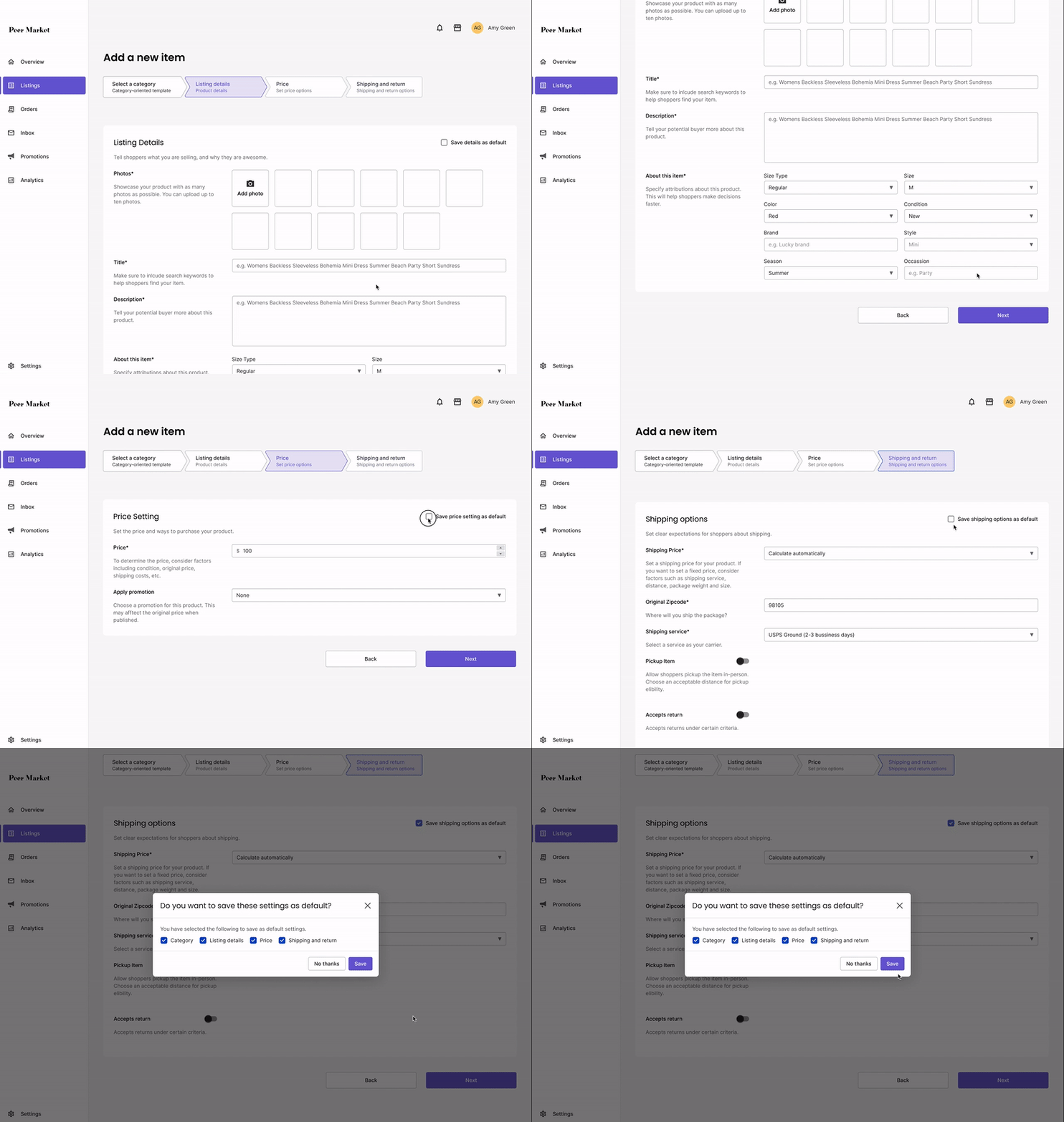
While listing an item, what if the user only wants to save partial setting as defaults?
During the listing process, users might want to save some settings as defaults for future use. However, within 4 main settings(category, product detail, price and shipping), users might only save the category and shipping options, since the others are usually unique and might not be applicable to the rest of the items.
Initial Solution
Ask preferences in the last step.
My initial thought is to use a modal to ask users which settings they want to save, as the last step of listing. The feedback I got was that users might have already forgotten what they have done in each section at this point. Without any reference, asking users to recall individual settings increases their cognitive loads.

Iteration
Ask preferences in each step.
I added a 'save xxx as default' option in each step of the listing process. Users can save the setting in the current section as they go. Since they can refer to their choices in place, this solution reduces the cognitive load in recalling.

Final Solution

Challenge 03.
How should I present a high volume of orders intuitively?
Managing hundreds of orders could be stressful. I would find a good way to display orders so that it could reduce administrative workloads and raise efficiency.

Option 1: Cards
Pros
Cards make the information easy to read.
Users can differentiate orders quickly
through images.
Cons
Cards occupy a lot of space and disperse the orders. Only 3 cards are fully shown in this screen size. Users need to do a lot of scrolling to locate an order when the number of orders accumulates. Also, if users want to select multiple orders that are not consecutive, they need to jump back and forth a lot.

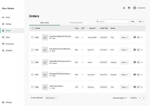
Option 2: Table
Pros
Order Information is more centralized using in a table setting. Users can skim through at least 5 orders at a time. Users can use the checkbox to select multiple orders and apply settings to selected items. This multi-choice pattern is widely used so that users won't need to
spend a lot of time figuring out how to apply bulk actions.
Cons
The information in this page may look too dense and difficult to read.
Solution
Display as a table, but separate adjacent rows with colors.
Since sellers are familiar with their listings, they don't need large images to identify items, and thumbnails will be sufficient in this case. Further, adjacent rows are separated with different background colors, which makes the content less 'clunky' visually.

Final Design
Avoid Repetitive Actions In Listing
Customized Default Setting
Users could then save the settings of an item as default for future use
Bulk Listing
Users can add multiple items to the 'listing basket' and publish them together(Think about putting multiple songs into an album, and then published the whole album, instead of publishing each song one-by-one)
Targeted Needs
Put a high volume of clothes into market quickly in the limited free time
Reduce Manual Effort In
Order Management
Bulk Order Editing
Users could select multiple orders at a time and change their status together
Auto Shipping Labels
Once the 'shipped' status are set, users can downloaded all shipping labels for selected orders
Automatic Order Updates
Order status will be automatically updated based on tracking information. Users will get the payment once the package is delivered, no extra actions required
Targeted Needs
Keep all orders on track without putting too much effort on administration
Helps users keep track of business performance
Performance Metrics Dashboard
Users can learn how their business is doing through the statistics of actively listing, orders, and finance
Personalized Insights for Business Growth
Shows market trends and provides strategy suggestions. Users could refer to insights to improve the store
Targeted Need
Know how the business is doing now and
what to improve
Prototype Overview

Reflection
Future Work
Potential usability issues to measure
Due to time constraints, I didn't conduct a usability test for this project. However, it ran through 4 rounds of design critiques and got plenty of feedback during the walk-through. The following shows a list of potential issues for validation.
-
Is the 'listing basket' concept understandable? Do users know they could add multiple items to a 'container' and then publish all of them together?
-
Is it clear that order status will be automatically updated? Do users need more instructions and hints?
-
Are the insights useful? What other insights user might want to see?
Potential feature improvement
How could we increase the efficiency of the bulk listing? Even though the default setting is useful, but users still update product names, photos, descriptions, etc. for each product. Is there a way to lift this burden?
What I Have Learned
Move on with whatever is given
It is the first time I start a project with (only) a persona. As the only artifact to represent the users, the persona is informative but also too underwhelmed. I am not confident to design an app without talking to real users. However, I understand that this might be more aligned with reality. Designers won't don't have the luxury to participate in the full research-design cycle. Sometimes we joined the team in the middle and have to move on with whatever resources we have. This project is a great practice and turns out there is always a way to design even with limited research materials.
Contextual scenario is an amazing artifact to identify user goals and design requirements
I love contextual scenarios! It is known that designers transform findings into design requirements like a miracle. The synthesizing process is usually ambiguous and hard to explain. Contextual scenario forces me to think through this process step by step, and establish a clearer relationship between user goals and design requirements.
